
The Persona series is a popular Japanese role-playing game franchise. It’s been around since the late 1990s, and originally, it wasn’t even its own series. Revelations: Persona was the first game, released all the way back in 1996. The series has had countless releases since, both main series and spin-offs included. The Persona franchise really took a turn by the third installment, released in 2006 on the PS2.
Persona 3 introduced a new foundation for the franchise. These JRPG dungeon crawlers now had life simulator aspects to them. This really added to the franchise’s charm. It was also in this entry that the series had a colorful aesthetic, along with a modern-sounding original soundtrack. Every game entry since 3 has had a very distinct visual style. Each game has a primary color and an even more beautiful visual design philosophy.
Persona 5’s Graphical Overhaul
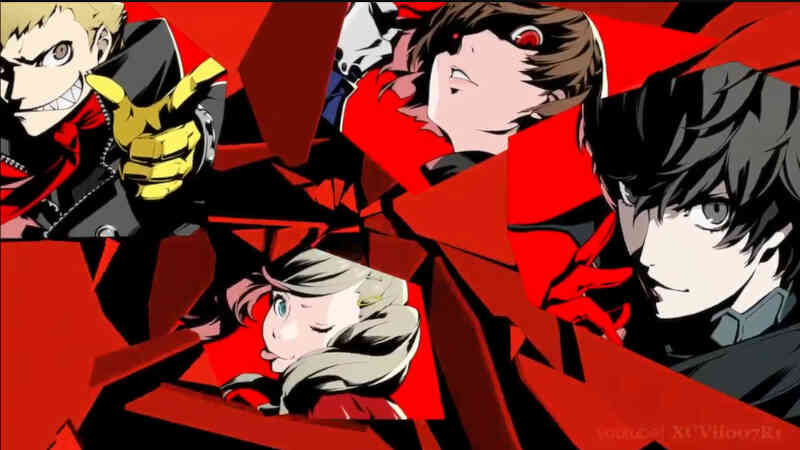
It cannot be stated enough how important Persona 5 was to all of this. 3 was the start of this visual change for the series. The fourth game also added a lot with its own aesthetic and cheery nature, but 5 stepped it up. 5 is infamous in the gaming landscape for having some of the most beautifully designed graphics, user interface, and menus in the entire space. Just take a look at those original trailers.
Those original trailers that showed the first footage of Persona 5’s gameplay all had gamers in awe. And this was just for the visual style and aesthetic alone. The jazzy soundtrack was incredible, but just take a look at those smooth menu transitions. There were content creators who made a series of videos just breaking down the menu transitions and heads-up display animations, that’s how expertly they were crafted.
Do Graphics Matter?
Why do these visual designs matter so much? It’s quite supplementary if you think about it. At the end of the day, are the Persona games any more mechanically complex than other RPGs? Do the visual aesthetics of Persona make it a necessarily better game by definition than say Final Fantasy, Dragon Quest, or Like a Dragon? No, they don’t. But that does not matter in this case.
What makes these graphical designs important is the effect on the player. When the player uses them, it makes the monotony of RPG grinding a lot less boring. Many of this writer’s personal favorite RPGs have, admittedly, rough-looking UIs. They’re not bad, but they’re just incredibly basic-looking. Final Fantasy XVI is a great game, but its interface and menus are a little by the numbers.
RPG Devs Should Learn from Persona
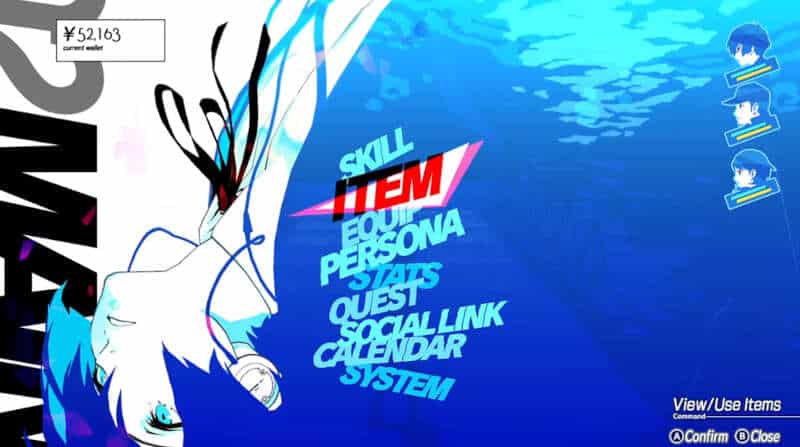
Look at the modern games now. Persona 5 and its expansion cut edition, Royal have incredibly beautiful user interfaces. The most recent game, that being Persona 3 Reload, released earlier this year, also has incredibly gorgeous menus. Again, these are all so extra and unnecessary. But the truth is, they aren’t. They make the game so much more pleasurable and enjoyable.
There is no RPG out there with better menus and user interface than the Persona games. ATLUS, the developers, are also releasing a new JRPG soon called “Metaphor: ReFantazio”. Take a look at that game’s menus, and it’s obvious Persona was a huge inspiration. This is great for the industry because better-looking menus mean more enjoyable games. Every RPG developer should take notes from these games, and implement their design philosophies for a more robust role-playing experience.
For More Great Content
Total Apex is an all-encompassing content producer. We provide heavily detailed articles every day on entertainment, gaming, sports, and so much more! Check out all our great sports content Total Apex Sports. Check us out on X @TotalApexEandG and our other sites: Total Apex Sports Bets and Total Apex Fantasy Sports.

")